
Roger Chen
In this project, our task is to use different techniques in processing images based on using the parts of the images in different bands of frequencies.
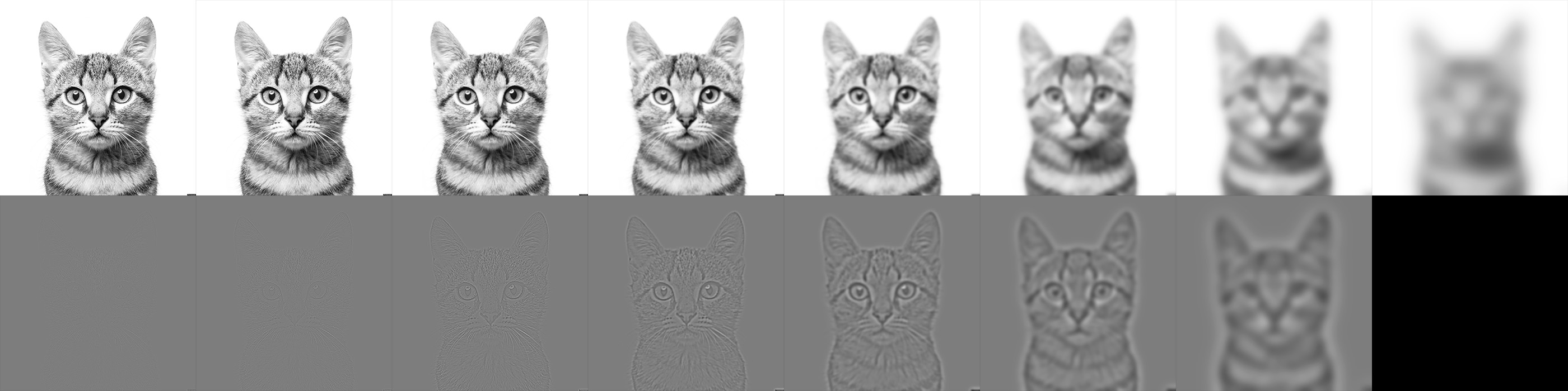
The first task was to use the unsharp mask introduced in class to sharpen an image. I used this image of the sea.
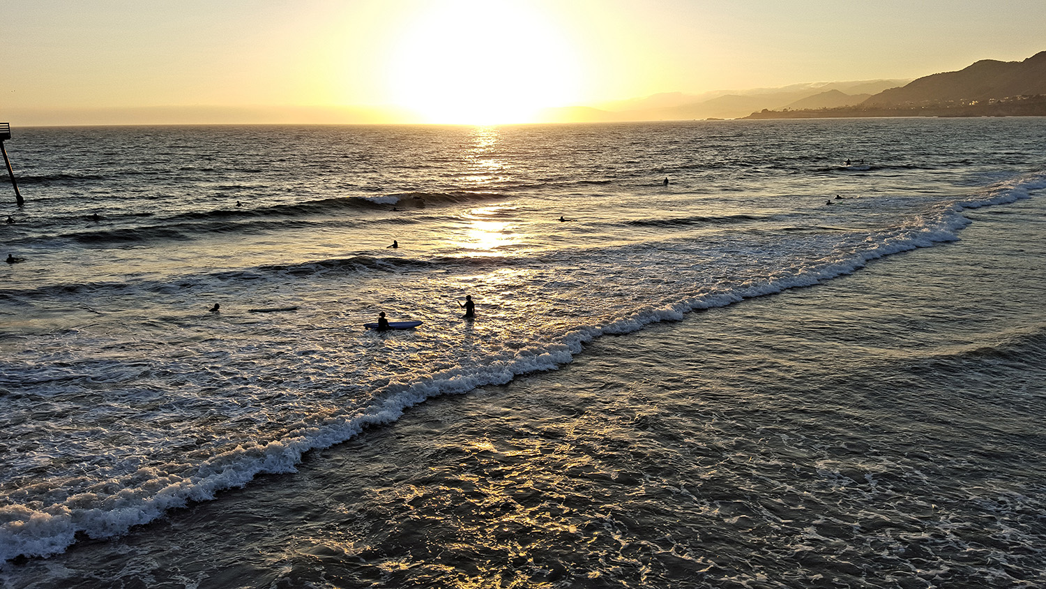
The unsharp mask was created by extracting the details of the image and adding 0.5 times more detail. The details were extracted by first taking the value component of the HSV representation of the original image, and then blurring it, and then taking the difference between the two.
Hybrid images were created combining the low frequencies of one image and the high frequencies of another image.
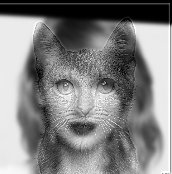
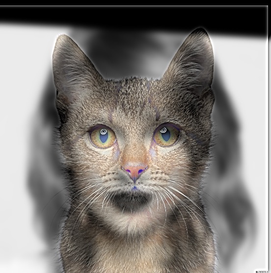
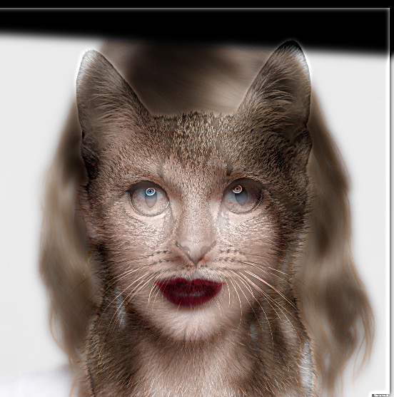
The input images are a picture of Taylor Swift and a picture of a cat. I chose the image of Taylor Swift because it is easily recognizable from a long distance, so it would work well as the low-frequency component. The cat is aligned on Taylor Swift at the eyes.
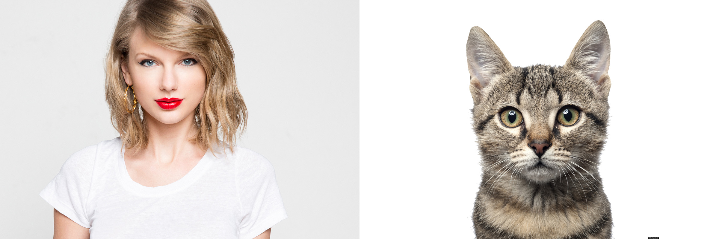
The resulting image looks like Taylor Swift from a distance.

You can visualize this effect in the frequency domain by inspecting the magnitude of the 2-dimensional Fourier Transform of each image, before and after it is filtered.
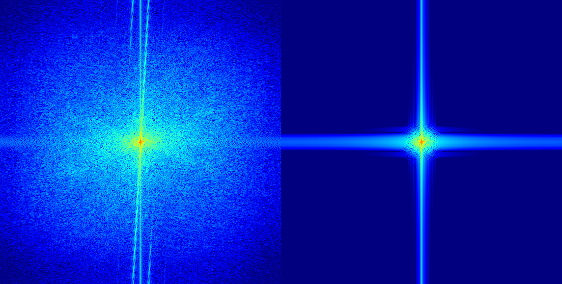
The scale in all of these frequency domain images is the same. You can see that the low-pass filter applied to the Taylor Swift image caused all of the high frequencies to disappear, leaving only the constant bias and the high values near the axes. On the other hand, the high-pass filter applied to the Cat image caused the constant bias to disappear.
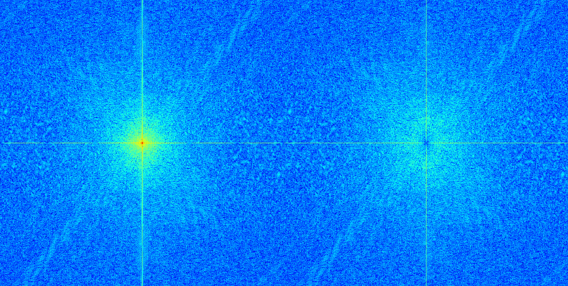
The resulting image looks like this in the frequency domain:
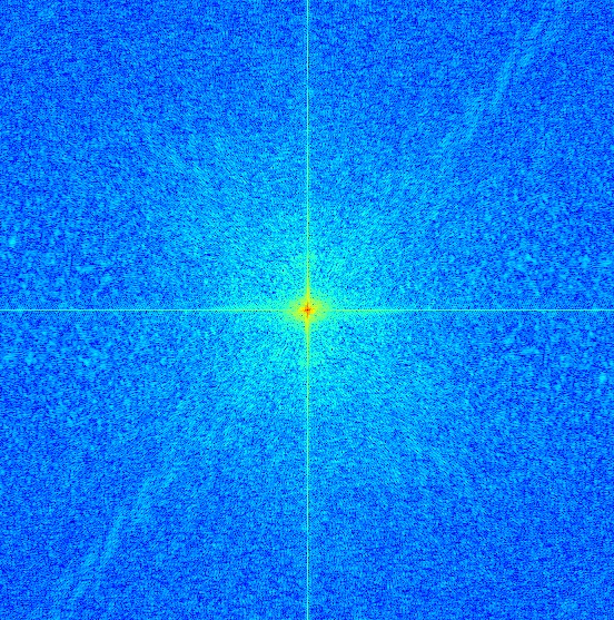
The high frequency features of the cat image, such as the pattern along the positive diagonal, can be seen in this visualization of the frequency domain of the output image. However, the high frequency bands in the Taylor Swift image cannot be seen here.
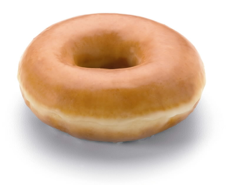
This one looks pretty good, because the donut is an easily recognizable shape, even at a long distance and grayscale. The donut appears as a shadow on the flower at a close distance, but the flower’s details disappear at a long distance.
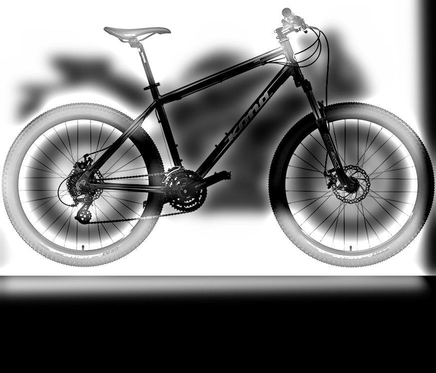
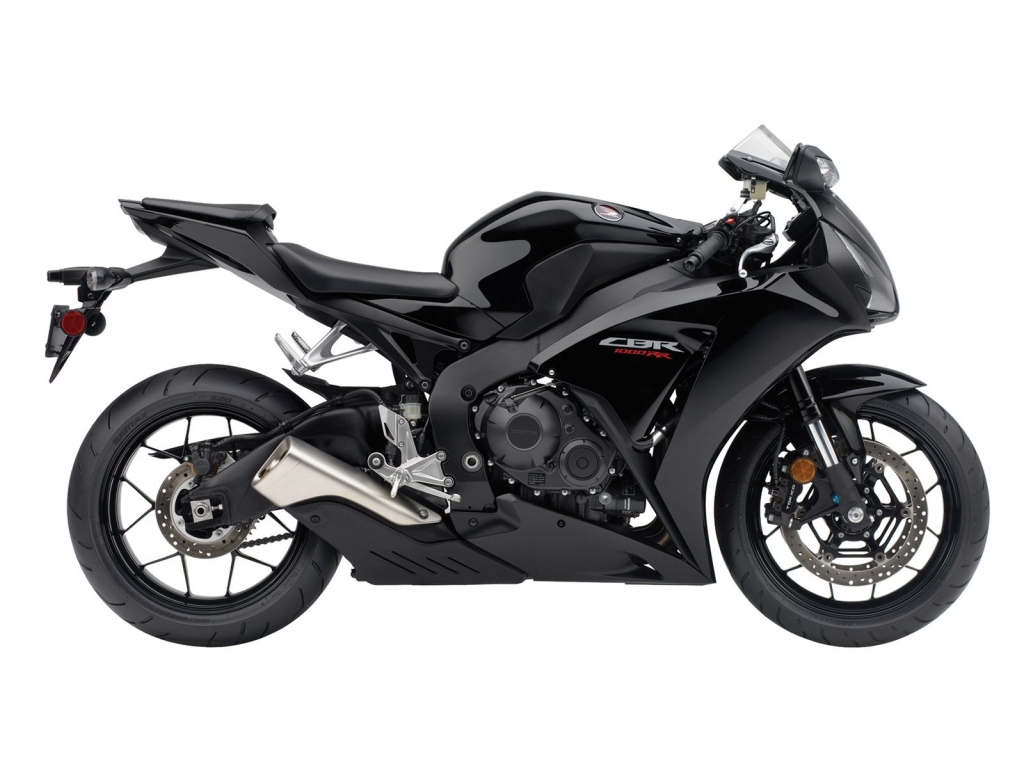
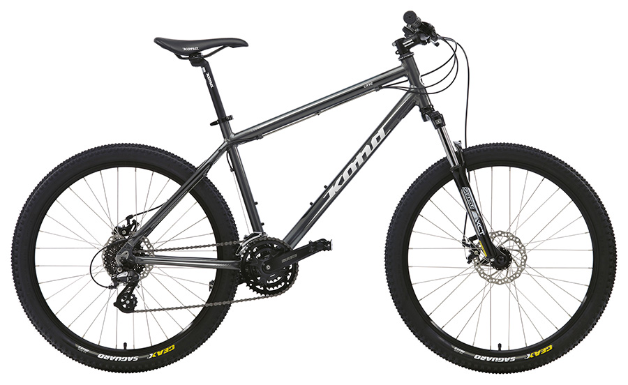
This one turned out just OK. You can still see the motorcycle at a long distance and the bike at a close distance. But the two shapes don’t align that well, and there is too much white background, so you can still clearly see the bike even at a long distance, especially since the seat of the bike sticks out. The algorithm seems to work better for simpler shapes.
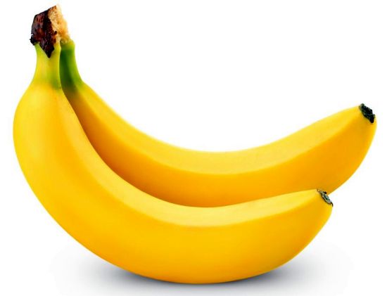
This one was really bad. We usually think of bananas as bright and yellow, but since this banana was on a dark background, it appeared as a dark shadow, which does not resemble a banana. The original images should be more similar too.
Since I used HSV to combine the images, adding color was as simple as bringing the Hue and Saturation components into the final image.
The image that uses the colors from the high frequency is the best. At long distances, color is less important and the shape of the image dominates. At a close distance, color helps accentuate the features of the high frequency image. Mixing the colors made no sense, because averaging two different hues would give an entirely different one, which appeared unnatural and odd.

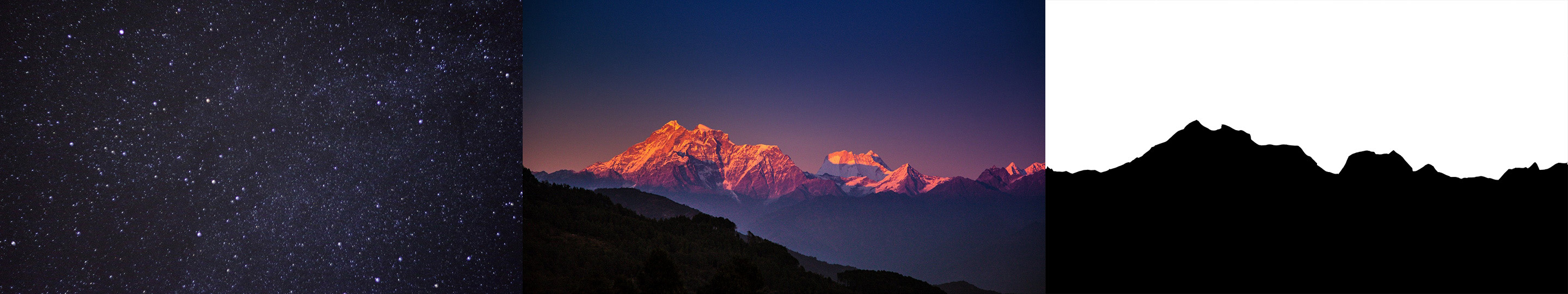
At first, I just traced the outline of the mountain and made that my mask. However, the output looked just as if I had cut out the mountain and pasted it into the stars picture. The multiresolution blending result was no better than just copy and paste.
Then, I tried blurring the mask, and it helped a lot. (Maybe I could have just increased the sigma of the gaussian in the algorithm too.)
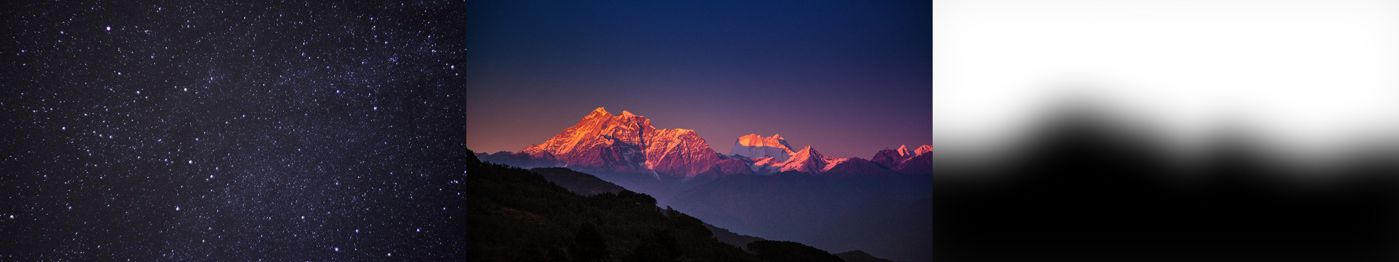
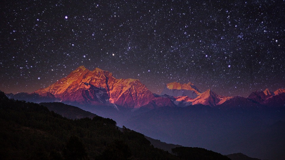
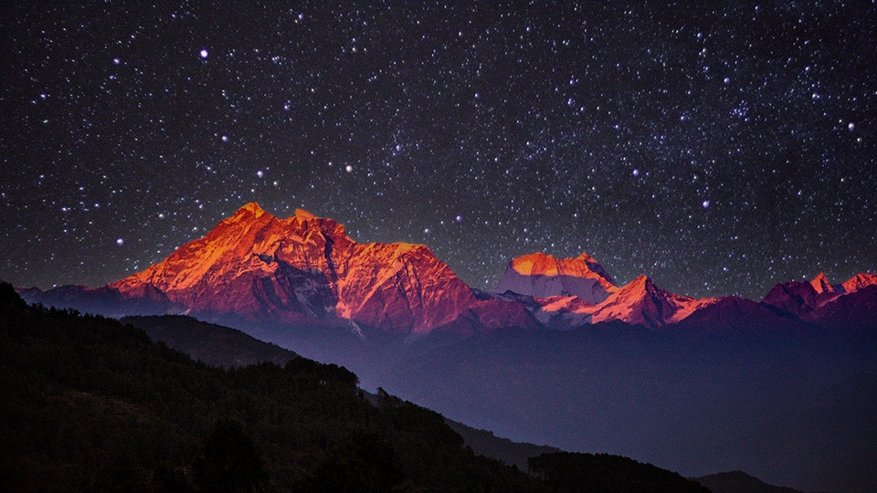
The glow of the mountains is now captured in this photo, and it looks more realistic. Here are the stacks for the inputs, the mask, and the output. I used the Gaussian stack for the mask, because I thought that made more sense.


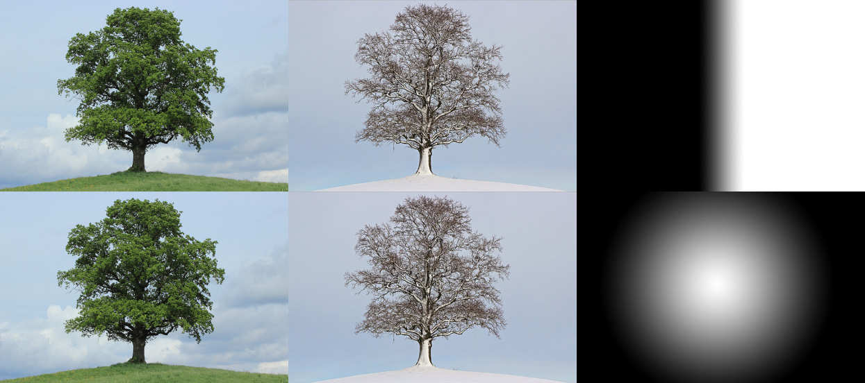
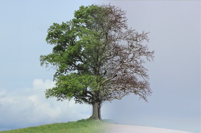
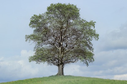
Here is a combination of pictures of the same tree in different seasons (Winter and Spring). I used two different masks.
Here is a combination of a moon and some stars. I blurred the mask in the 2nd version of this. (Maybe I could have just increased the sigma of the gaussian in the algorithm too.)
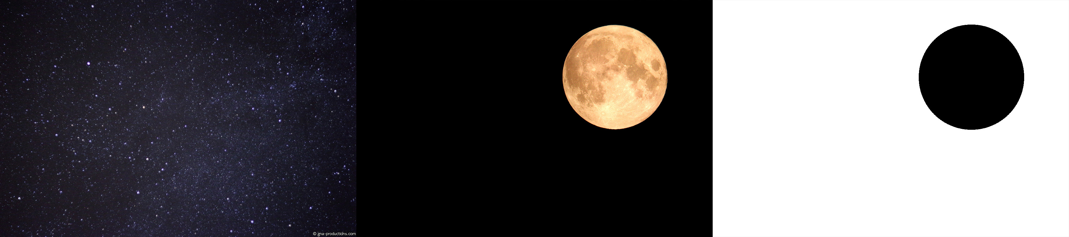
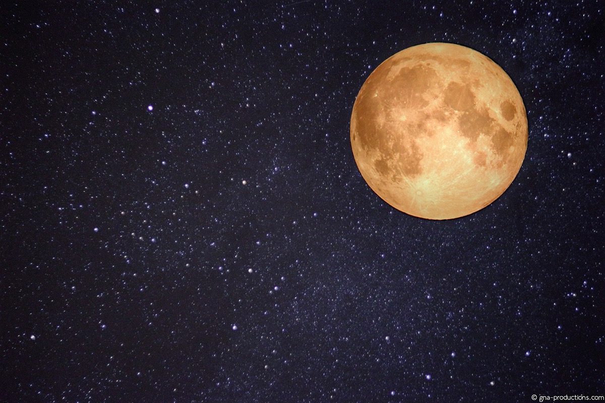
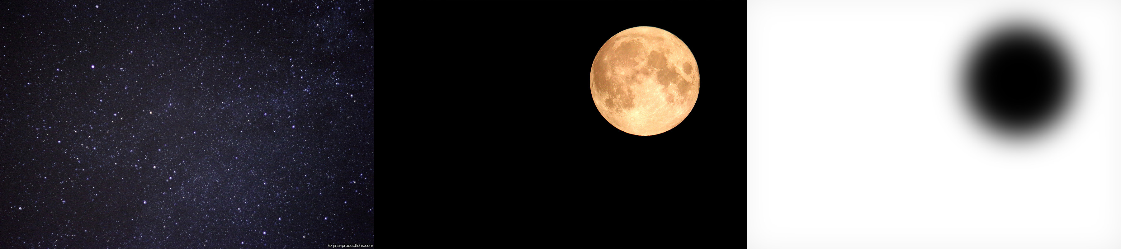
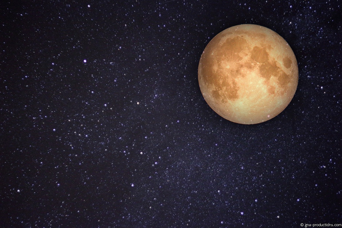
The 2nd version looks better because the moon's dark background blends into the stars. The first photo looks like I just cut and pasted the moon from one photo to another, without any blending. That is likely caused by the harsh edge of the filter.
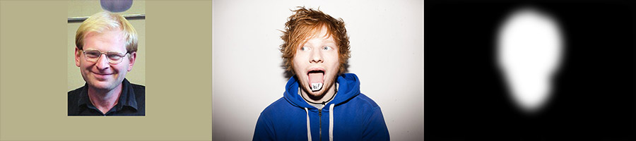
I tried combining Ed Sheeran and Professor Alexei Efros. I tried 7 different masks that captured just the face and the visible portion of the neck. However, Ed Sheeran’s hair still sticks out, and it doesn’t look realistic. Increasing the size of the mask did not work either, since it just resulted in an image that included a lot of the background of Alexei’s photo, superimposed on Ed’s photo.
The reason for this failure was essentially that multiresolution blending can only blend existing data. It cannot fill in pixels that are supposed to be there from context, like the pixels that should be in the background instead of Ed’s hair.
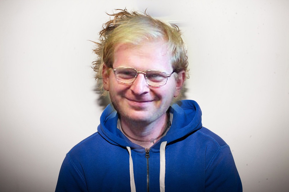
However, the neck blending looks pretty realistic. I also adjusted the white balance of the original photo of Alexei Efros to match Ed’s photo better.
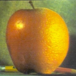
Finally, here is my Orapple.
The coolest thing I learned from this project was that a lot of the desktop wallpapers I use look like some of these blended images! I think multiresolution blending is used to make images that have impossible exposures, like an image with both the moon and the stars in view.

