
Remastered
Commonly used in the music industry, remastering is the process of refining or reviving an old piece of art. Often, remastered pieces have qualities and nuances that are completely original. This is RogerHub Remastered.
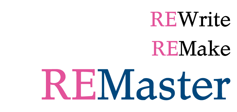
Rewrite: RogerHub’s internal generator, Boggert, was the cause of a lot of problems. It’s very inflexible and slow. (Kind of like Internet Explorer) So, I’ve made a series of changes and dubbed the new version, Boggert 2.0.
Even though Boggert’s technical problems were fixed, RogerHub still had a design that looks like it was made by a 6-year-old with a crayon. The actual page is limited to 800 pixels no matter how big your screen is. Posts only have 500 pixels of horizontal space. The font is tiny and invariable across all pages. The AJAX is old and ugly. Visual effects are missing, and to finish off my list of flaws, it doesn’t validate.
I’m not the biggest standards fanatic, but when Internet Explorer gives up its revolt against the W3C, I’d like to be ready for it.
Ultimately, a design remake is in order. Over the past year, I’ve read a lot on typography, composition and the art of efficient design. There’s a certain irony that surrounds the blogs of design critics. Often, the sages of web design have crappy site designs themselves. I had wanted to make my new RogerHub design as professional as possible. That didn’t work out.
I’m not a freelance designer, nor do I ever hope to be one. But I do want RogerHub to reflect what I do as a hobby. So I tried a more personal approach and drew out a full mockup with a tablet and pen. For colors, I used black and dark blue, my favorites. I’m sick of everyone’s abnormal serif-phobia, so I used the second most hated font of all, Times New Roman. The main content area is 980 pixels wide: small enough for the smallest of screens, yet still able to display stunning photos,
I wanted to break the traditional model of distinct header-content body-footer. I didn’t use borders for any of the sections, and the full-width divides will scale to any sized screen. The design is fully compatible with all major non-IE browsers. Collectively the design is awesome.
The blog scene has been dead lately. Maybe it’s cause of AP testing, or maybe it’s that evil, evil Facebook. (just kidding?) But I’m hoping people will start blogging again. To motivate you, I’ve put a More Stuff section underneath every post. In that section, updates from my partner blogs will be aggregated and displayed for everyone to see. (Kenny I still need a working RSS from you nevermind, i got it) I’ll post again in the coming week to show you how much difference the extra horizontal width can make.
Got a blog? roger (at) rogerhub.com
Enjoy RogerHub 2.0
-Roger
3 CommentsAdd one
Layout feels a bit awkward, but so far it looks pretty good =)
peeeeeeeeeenis
HEY YOU HAVE BLOG UPDATES FROM OTHER PEOPLES!! THAT’S SO EPIC <3
ROGER YOU ARE THE BEST.
I LOVE YOU.