Full-size buttons!
So, the latest new Boggert feature: Full-size buttons!
Now, in the bottom right corner of every picture i post, there’s a button you can click to see the full size.. I hope this gets rid of the confusion
Example:
I used negative-positioning to do this. It’s actually pretty easy.
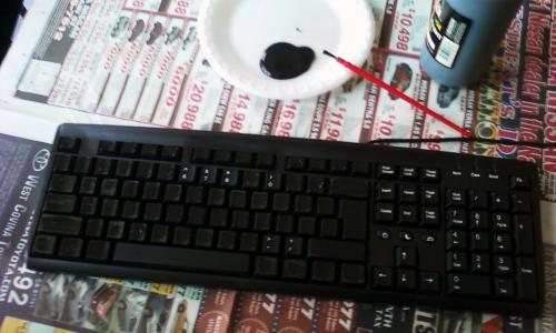
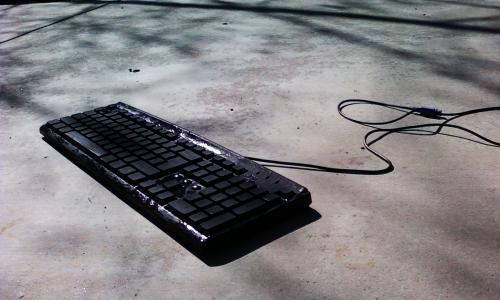
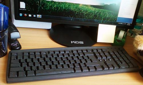
soo.. I painted a keyboard with tempera paint.. which was a bad idea, since it comes off with water. I should have used spraypaint =_=
Hmm.. Now I don’t know what to do with it.
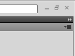
Lately, Adobe’s been pretty mean to me. Do you see a difference in these two pictures?
Well, they’re both snippets of the top righthand corner of my screen. The first window’s not maximized, the second one is.. so, if the corner is rounded, pressing the top-left-most pixel of the screen actually closes my Firefox (which is underneath my DW)
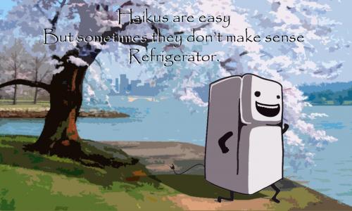
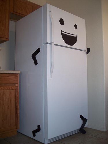
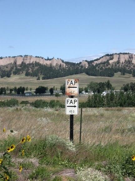
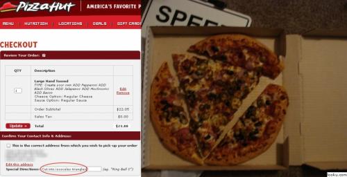
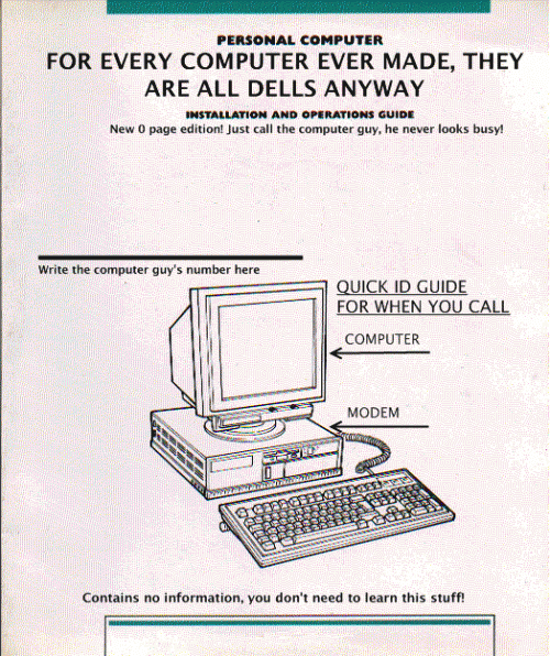
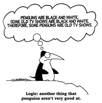
Hmm, so none of the following pictures are mine, they’re all from imgur.com and the people who posted on imgur..
Okay bye
-Roger
-Roger






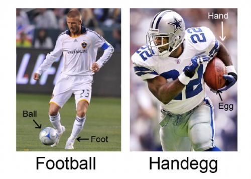
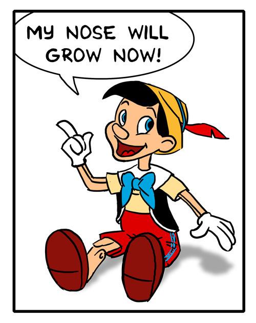

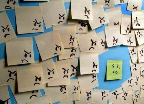
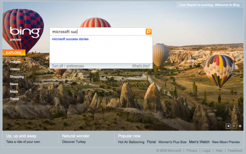

9 CommentsAdd one
LIES. you just fail at coloring -_- i’ll help you over spring break :) btw you need to fix your fail mooosic player b/c i can’t do my chem homework if each song stops halfway and a new song starts playing D:
The background for the content-area is F8F8F8.. which is like, really really really light gray... and completely colorless.
I’m serious, anything except grays would look awful
no... like light colors. since your backgorund is light blue anyways, using other light colors will be okay. if it looks horrible, its cuz you did it wrong :)
Well, I laughed...
:DD
That would look pretty horrible -_-
Like gray and white? or like black and white?
alternating background colors for each post
How do I do that..?
Maybe a darker horizontal rule?
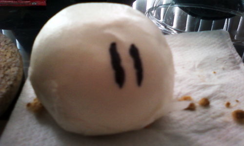
where’d the dango come from? it looks like its sitting on our kitchen table, which means... you made it?? o.0
you should find a way to better differentiate the different posts from each other, especially since each post is sooo long. by the time i scroll down far enough to see the comment box, i cant tell if its still for the first post or if i accidentally skipped a whole post thing. know what i mean?
aaaaand... i didn’t understand the whole ‘full-size" button until after reading the entire page (Which is like 3 post) the whole time, i was looking for really big buttons... LOL
I finally understood what the FAP one meant.
And the Zelda one...it’s a ruppee right?
&& is that a dango? D:
and why would you paint your keyboard? =__=
to piss your visitors off? because they can’t find the "n"? -__-x
oh and. get a life =3=
just kiddingg (: